
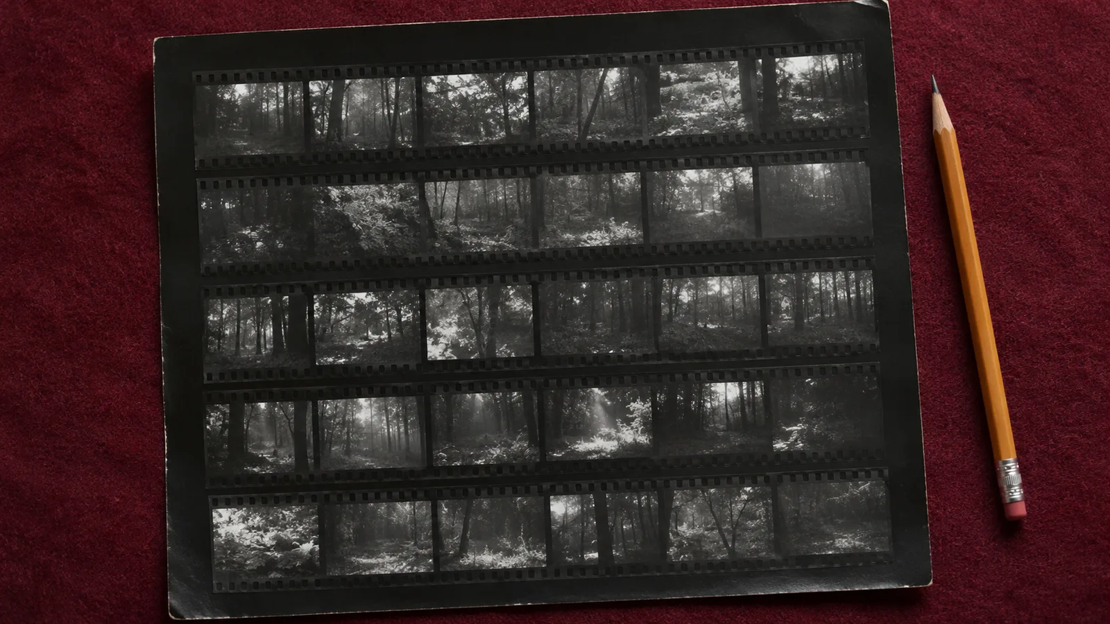
A photograph can look inevitable once it has been chosen. The expression seems exact, the arrangement feels balanced and the small interruption in the background appears almost fortunate. The surrounding frames tell a less tidy story. A hand was in another place. Someone looked away. The photographer moved closer, changed direction or waited. Looking at those alternatives makes selection visible as work, rather than treating the final image as the only thing the camera could have produced.
That is the enduring value of a contact sheet. It places photographs close enough together for relationships to appear. The format can belong to a film workflow or be assembled from digital files, but its editorial purpose remains useful. It lets a photographer compare, hesitate and reconsider without giving every image a separate dramatic entrance on the screen. For a small publication, that can be the difference between choosing attractive pictures and building a coherent account.
The contact sheet also creates a record of decisions. The Morgan Library’s presentation of Peter Hujar’s contact sheets describes an archive through which a photographer’s working process becomes available for examination. It is a reminder that the selected enlargement and the material around it answer different questions. An exhibition announcement should not be read as a promise of current access; the institutional material is relevant here as a documented example of an archive. The Morgan Library’s Hujar material
Make the comparison legible
A useful sheet begins with images that can actually be compared. Keep a consistent thumbnail size and make the frame boundaries clear. Include enough identifying information to find the original again, while keeping private material out of any version shared externally. The sheet does not need elaborate graphic design. Its job is to support decisions that would be difficult to make while opening and closing individual files.
For a hypothetical story about a neighbourhood bakery, assemble the relevant frames in shooting order first. That preserves useful evidence about how the scene developed. You might discover that the strongest expression arrived before the camera moved into its most elegant position. Or you might find that the close view removed a relationship between workers that the wider frame had explained. Seeing the sequence keeps those alternatives available.
Do not begin by including only the images you already like. That produces a display of a decision made elsewhere, rather than a chance to test it. A first review can exclude files that are clearly irrelevant or technically unusable, but retain plausible alternatives. The unexpected choice often emerges from a relationship you could not see when each frame occupied the whole screen. A less dramatic image may become important once the story has a shape.
When several versions differ through editing rather than capture, identify that difference. A darker treatment is not another moment in the scene. A cropped file is not another camera position. These distinctions matter when discussing what the photographs show. Without them, a review can accidentally compare different editing decisions as if they were evidence of different events. Keep the capture sequence and the treatment comparison understandable as separate parts of the work.
The sharpest frame may not carry the story
Technical inspection has a necessary place. A publication needs images that survive their intended use. But a contact sheet should also make it possible to ask what an image explains. Does it introduce the setting, show an action, establish a relationship or reveal a consequence? A photograph with immaculate detail can still repeat information already supplied more effectively by another frame. Technical quality does not answer every editorial question.
In the imagined bakery, a clean close-up of flour on a table may be visually appealing. A wider, slightly less polished frame might explain who is working and how the space is shared. Neither role is automatically superior. The editor needs to know which role the story currently lacks. Choosing only the most immediately striking thumbnails can produce a sequence full of details with no sense of where they belong.
The intended size changes the technical judgement too. Inspect the candidate at a realistic output size, and examine the original when a potential fault matters. A thumbnail can conceal an expression, a distraction or a focus problem. It can also make a perfectly usable photograph seem less impressive than a heavily processed alternative. The sheet is an overview. A final decision should return to the files that will actually be delivered.
It helps to write the reason for a selection in ordinary language. Introduces the room. Shows the exchange. Connects the baker with the customer. Those descriptions make a review discussable. A star rating alone records preference without explaining its purpose. If the sequence changes later, the original reason can reveal why a once-promising image no longer earns its place, or why an overlooked frame has become necessary.
Repetition is sometimes the problem
Several good photographs can make a weak sequence if they all perform the same task. Three close portraits may show different expressions while leaving the reader uncertain about the activity. Four establishing views may explain the building repeatedly without bringing anyone into it. A contact sheet makes this repetition easier to recognise because the images compete in the same visual field. Their similarities stop being hidden by the time between full-screen views.
Try arranging a provisional sequence and describe the new information introduced at each step. If two adjacent images answer the same question, decide whether the repetition has a purpose. It might create rhythm or establish a meaningful contrast. It might also be a sign that you are reluctant to reject a favourite. The distinction becomes clearer when you can explain what the second frame adds beyond its individual attractiveness.
In a hypothetical six-image bakery story, the sequence might need an introduction, a process, a relationship and a closing observation. That is an example of editorial thinking, not a template every story must follow. Another account might revolve around one person’s changing expression, or around the relation between finished goods and manual work. The sequence should emerge from the material and the reporting, rather than force every assignment into an identical set of picture types.
Leave the rejected alternatives available during review. Removing them too early can make the first arrangement feel more final than it is. A frame that seems redundant in one position may work elsewhere, while a photograph chosen as an opening may explain more after another image has established context. Selection and sequencing influence each other. A contact sheet supports that movement because it keeps the surrounding material within reach.
A crop is another editorial decision
A tighter crop can simplify a photograph, but simplification is not automatically clarification. It may remove a distracting edge or conceal a relationship essential to understanding the scene. Before accepting a crop, compare it with the full frame and describe what has disappeared. The question is especially important in documentary work, where the reader is likely to treat the image as evidence about a situation rather than as a purely decorative arrangement.
Suppose a photograph shows a worker responding to another person just outside the planned crop. Removing that person can make the worker’s expression appear directed at the viewer, or detach it from the exchange that produced it. The resulting image may still look convincing. That is precisely why the change deserves an explicit decision. Visual plausibility alone does not establish that the revised framing supports the reported account.
Mark crops so that another editor can distinguish them from original capture boundaries. If several people are reviewing the material, agree how proposed changes will be recorded. A rough rectangle on a proof can be sufficient for discussion, provided the final export is checked separately. The working sheet should help communicate an intention. It should not become the sole place where an undocumented alteration survives.
The International Center of Photography’s library entry for William Klein’s Contacts describes reproductions of contact sheets that were painted and reworked. That institutional example demonstrates how a working sheet can itself carry visible interventions. For an everyday editorial workflow, the lesson is practical: preserve enough context to tell what is a captured frame and what is a decision made about it. ICP’s catalogue entry for Contacts
The sheet does not replace reporting
An expressive moment can invite an explanation that the photograph alone does not establish. Someone looking tired might be concentrating. A gesture that appears angry may belong to a different exchange than the viewer assumes. When building a story, connect the visual edit with the notes and verified information from the assignment. The contact sheet helps you see alternatives. It does not grant access to the thoughts of the people in them.
Write captions from the available evidence, and keep uncertainty visible where it matters. If the reporting confirms an activity, identify it accurately. If an interpretation belongs to the photographer, do not smuggle it into a caption as an observed fact. A sequence becomes more credible when the words and images support one another without claiming more than either can show. An emotionally satisfying arrangement is not a substitute for that discipline.
Review the effect of omissions as well as inclusions. A sheet can contain evidence that complicates the easiest narrative. Perhaps an apparent solitary worker was part of a team, or a quiet moment belonged to a crowded event. You do not need to publish every frame. You do need to recognise when removing context would make the remaining selection misleading. The rejected photographs can be an important check on the account you are constructing.
Privacy also changes how working material should circulate. A contact sheet may contain bystanders, identifying details or frames that were never intended for publication. Share it through the agreed channel and with the people who need to review it. Making a photograph small does not remove the information it carries. Prepare a separate public version if the sheet itself will become part of a portfolio, workshop or article about the project.
Make the final selection traceable
Once the sequence works, connect each selected thumbnail to its original file and final export. Use names or identifiers that remain stable through delivery. A decision communicated only as the third image on the second row can become ambiguous when the sheet is rearranged. This is a small administrative step with a substantial effect: it prevents a thoughtful edit from being undermined by sending the wrong near-identical frame.
Keep the approved order and captions together. If a designer changes the sequence to fit a layout, review what that change does to meaning, not just whether the pages look balanced. The relationship between images can carry information that a layout adjustment accidentally alters. A final proof is therefore another editorial stage. It should be checked against the purpose of the selection, rather than treated as a purely cosmetic confirmation.
Save a version of the working decision that you can understand later. It can include the approved sheet, a short explanation of the sequence and references to any relevant reporting. This is useful when an image is reused months later or when a client asks why a particular frame was chosen. You should not need to reconstruct the decision entirely from memory, especially if the project contains many similar photographs.
The contact sheet remains valuable because it slows down the moment at which one frame becomes inevitable. It allows a photographer to recognise that an attractive picture can be wrong for a story, that a quiet image can connect two stronger ones, and that an omitted frame can challenge the simplest account. The finished sequence may look effortless. Preserving the work around it helps ensure that the apparent ease rests on deliberate and explainable choices.