
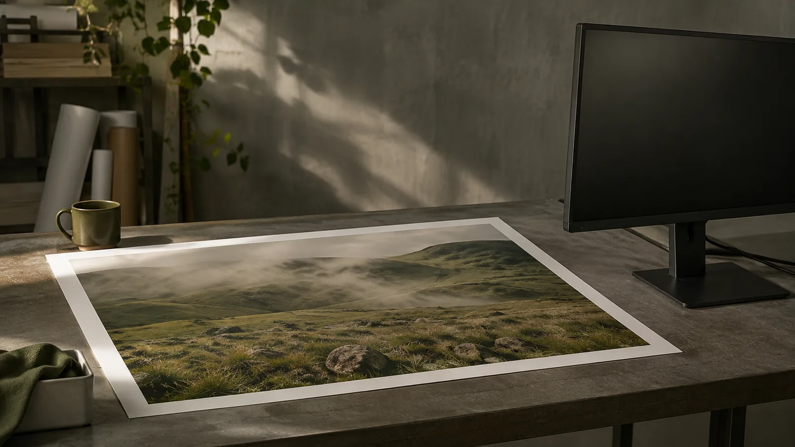
The photograph looks finished on the monitor. The shadows have detail, the skin feels natural and the green coat separates neatly from the background. Then the first print arrives. It seems darker, the coat has lost some of its character and the careful adjustments suddenly look uncertain. The tempting response is to brighten the file and send it again. Sometimes that changes the result in a useful direction. It does not explain what happened, and it can leave the next photograph with exactly the same problem.
A screen and a sheet of paper present a photograph through different physical systems. One emits light. The other is seen through light reflected from its surface. Their relationship also involves the file, the software interpreting it, the output process and the environment in which somebody judges the result. That is why an apparent disagreement is best investigated as a chain of decisions. Buying another device or dragging one slider cannot establish which link caused the difference.
For a creator selling a small photographic edition, the practical objective is a repeatable process. You need to know what was approved, how it was produced and under what conditions the print was examined. Perfect identity in every possible room is a poor promise. A controlled and explainable result is something you can build into the work, discuss with a printer and use when preparing the next edition.
Start with the photograph you actually sent
Before looking at the equipment, identify the exact exported file. A project can contain an original camera file, several edited versions, a web export and a print export with very similar names. Open the file that reached the printer, rather than the working document you remember approving. Check its dimensions, colour profile and editing version. This does not require a complicated filing system. It requires a reliable answer to the question of which object is being compared.
Consider a hypothetical portrait commission. The editor approves one version in the editing application, then uploads an older export through a browser window left open from the previous day. The physical print is a reasonable rendering of the uploaded file, but it is being judged against another image. A further adjustment to the current working document would solve the wrong problem. Version identification should therefore precede any conclusion about monitor accuracy or printer quality.
Ask the printing service what it expects. The requested file format, profile and treatment of automatic corrections form part of the delivery specification. Write those requirements down alongside the export. A general statement that a service accepts photographs is not enough to infer how every uploaded profile will be handled. If you use a different laboratory later, confirm its requirements instead of assuming that a successful recipe transfers unchanged.
The same discipline applies at home. Keep the image, paper choice and print settings connected in your notes. If a test succeeds, you need enough information to repeat it. If it fails, you need enough information to change one part deliberately. A stack of unlabelled proofs can become surprisingly difficult to interpret, particularly when several versions differ only slightly in brightness or shadow treatment.
A profile describes a condition
Colour management is often reduced in conversation to finding the correct profile. A profile matters because it describes a colour relationship within a particular workflow. It is not an instruction to make every device capable of reproducing every visible colour. EIZO’s printing guidance explicitly discusses the limits of colours available in a print, and the role of matching settings in colour-managed software. EIZO’s explanation of printer settings
In a hypothetical landscape, an intensely coloured flower may be easy to display but difficult to reproduce with a particular ink and paper combination. The editing decision then becomes artistic as well as technical. You might preserve separation between nearby colours, reduce the intensity of an isolated area or accept a particular compromise. The useful question is what the final photograph communicates, rather than whether a single colour retains an impossible numerical identity through every output.
Read a printer profile in relation to the conditions it names. If it belongs to a particular paper or output process, check that those are the conditions being used. A profile chosen because its filename sounds close to your paper is not a documented match. Ask the supplier when the relationship is unclear. Keeping a copy of the delivery instructions can prevent a successful first test from turning into guesswork months later.
For software-controlled printing, establish which part of the workflow performs the colour conversion. Adobe’s current printing documentation explains the application-managed and printer-managed approaches and the settings needed for them. Follow the instructions for the selected route and your actual driver. Mixing assumptions from two different routes can make a result harder to interpret. Adobe’s colour-managed printing documentation
The monitor is also an adjustable instrument
A monitor’s brightness affects how an image feels while you edit. An overly luminous display can make a dark photograph look comfortably open, encouraging choices that disappoint on paper. That possibility is worth testing before compensating by brightening every print export. The point is not to prescribe one universal brightness number. It is to relate the editing environment to the output conditions you are trying to evaluate.
Distinguish a display setting from a measured description of the display. Adjusting a control changes the instrument. A profiling process characterises its behaviour under chosen conditions. These operations are related, but they answer different questions. If a calibration tool or software workflow is part of your setup, use its documented procedure and keep the resulting settings consistent while comparing proofs. An undocumented mixture of visual tweaks and measured steps defeats the purpose of having a reference.
The room around the screen deserves attention too. Reflections and strongly coloured surroundings can make visual comparison awkward. Automatic changes in display appearance can also interrupt a controlled review. Establish a stable viewing arrangement and record it, particularly if you work on a laptop that moves between a bright kitchen and a dim studio. A photograph should not receive a different edit every time the computer changes rooms.
This is an argument for consistency before expenditure. An expensive monitor still participates in a process that can contain the wrong export, a mismatched paper setting or a misleading viewing light. Conversely, knowing the limits of a modest setup can help you decide when a physical proof is necessary. The appropriate purchase question follows the diagnosis. It should not replace the diagnosis with a list of desirable specifications.
Paper is part of the picture
A print has a surface, a white point, a texture and a response to the light in which it is viewed. A photograph intended for a glossy surface may feel different on a textured matte sheet even when the workflow is correctly managed. That difference can be part of the artistic choice. It should be evaluated as a change in the finished object, rather than automatically treated as a production mistake.
For an imagined edition of quiet woodland photographs, a soft paper might support the intended atmosphere while reducing the apparent force of the deepest areas. The photographer can assess whether the important branch shapes remain distinct. For a different series built around hard graphic contrast, another surface might be more appropriate. These are hypothetical judgements, not claims about the measured performance of a named product. The test print supplies the evidence for the particular image.
Keep the paper name and the actual print together during comparison. Packaging can be discarded or separated, and two visually similar sheets may have different intended settings. If a laboratory makes the print, ask which material was used and whether it changed between orders. A reorder should have a clear specification. Otherwise a discussion about colour can conceal a change in the physical substrate beneath it.
View the proof in more than one relevant environment, while keeping the evaluation deliberate. First use the agreed reference conditions. Then consider the room where the photograph is likely to live. An exhibition print and a small object sold at a market may face different practical expectations. You cannot control every future lamp, but you can describe the conditions under which you judged the work and avoid promising an identical impression everywhere.
Separate a preview from an approval
A simulated print preview can help identify a potential difficulty before ink reaches paper. It remains a simulation built from the profile and viewing assumptions selected in the software. Treat it as a way to ask better questions of the physical proof. If a saturated area changes visibly in the preview, inspect the corresponding area in the test print. If the preview and print disagree substantially, investigate the conditions rather than immediately deciding that every simulation is worthless.
When a client reviews the photograph remotely, establish what they are approving. A web-sized preview can settle a choice of image or crop. It is a much less controlled basis for agreeing the exact appearance of a print. Their display and room are outside your setup. Explain the purpose of the preview in ordinary language and use a physical sample when the surface or colour relationship is central to the commission.
This distinction can prevent a production dispute that begins as a vague comment about darkness. A person may approve the composition on a phone, while the photographer understands the approval to cover the final paper object. Documenting the stages makes the decision clearer for both parties. It also allows a late request to be identified accurately as a new preference, a correction to an agreed result or a problem requiring another test.
A useful proof is an experiment
Choose a test image containing the relationships you care about. If the edition depends on subtle shadow detail, include a passage that makes that detail easy to judge. If people are the subject, include representative skin and clothing. A random attractive picture may conceal the very difficulty you need to investigate. The most useful test is not necessarily the most dramatic photograph. It is the one that helps distinguish the possible causes of a mismatch.
Change one meaningful variable between tests and record it. For example, compare two exports prepared for the same documented output condition while leaving the paper and driver settings alone. Or compare two paper choices using their respective correct settings, understanding that this tests a change of finished object rather than an isolated slider. State what the comparison is meant to answer before spending time interpreting small differences.
Keep a physical reference once the result is approved. A dated proof with a clear link to its file is more useful than a memory that the previous order looked slightly warmer. It can support a conversation with the printer if a later run differs. It also protects the editing process from endless adjustment. Once a version has met the intended purpose under the agreed conditions, preserve that decision as part of the project.
The final review should include the photograph as a whole. Technical checks can explain why two greens differ, but the edition also needs coherent sequencing, appropriate cropping and a surface that suits the work. A small colour discrepancy may be less important than a lost expression or an awkward border. Diagnosis gives you the freedom to make that judgement consciously. The first print then becomes evidence for the next decision, rather than a reason to distrust every image on the screen.